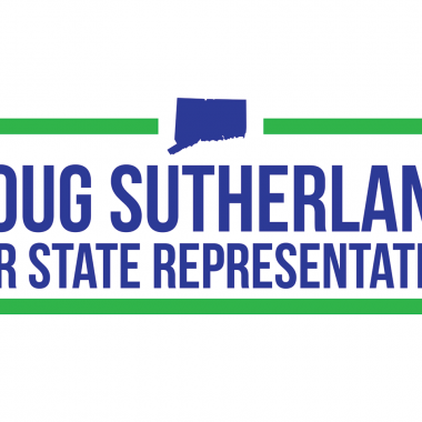
In 2014, my dad ran for state representative in the 123rd District in Trumbull, Connecticut. I assisted his campaign by designing his logo.
My goal for the design was to keep it simple and legible along with a few touches to make it local. I selected a very readable sans serif font and a two color palette loosely drawn from the colors in the Trumbull town flag. The green and blue allowed the design to stand out from other common campaign colors. The dimensions of the design allowed it to work well on printed literature, business cards, social media and the web. The silhouette of the state of Connecticut gate the logo an additional local touch while emphasizing it was a state elected position.
The yard sign dimensions were more square than the logo, so I modified the logo slightly for that application. The reworked design allowed the name to be even larger and more legible and there was room at the bottom to include the campaign’s web address.


